greenhouse gas emissions
Since the late 19th century we human beings every single year have emitted more than a century's worth of greenhouse gases at 1750-1800 rates. Then we really accelerated GHG emissions and now we emit multiple centuries worth every year. As a consequence the world's climate is coming under increasing stress. If the world warms sufficiently to melt the arctic permafrost then massive amounts of GHG will be released which in turn will tip us into a very unpleasant world of severe flooding, droughts, food shortages, and both economic and social disruptions. To ameliorate this problem, international agreement was made at the 2015 Paris Climate Change Conference to reduce GHG emissions. The expressed goals are to achieve zero net growth of anthropogenic greenhouse emissions before 2200 and also to limit the temperature increase to 1.5C° by severe cuts to GHG emissions as soon as practical.
Several years ago I began charting various sources of greenhouse gases on a global scale, so as to have early indication whether governments have been able to achieve the necessary emission reductions to slow climate change. Mediocre reductions won't do -- only massive reductions can do the job. I'll only be charting carbon-based emissions, not nitrous oxide or halogenated substances.
I'm sure you've heard the joke about traffic lights, you know green lights mean go, red lights mean stop and amber lights mean race. It's funny because its so often true in our real world. So if the Paris Climate Change Conference is the world's amber light, will nations slow anthropogenic emissions of greenhouse gases, or will they race to produce more? The results so far strongly indicate they are racing to produce more.
greenhouse gas emissions from Fossil Fuel Production and Combustion
GHG Emissions from Combustion of coal

Estimated GHG Emissions from coal combustion
This chart shows GHG emissions produced by combustion of coal since 1750. We are now burning so much coal every year that the GHG emissions prior to 1840 have been pushed right down onto the X axis. Note the huge increase in GHG emissions since 2000. Encouragingly, the rate of increase has begun to slow. My forecast is for continued long-term GHG emissions due to coal combustion.
2018 Update: GHG missions from combustion of coal appear to have plateaued, similar levels 2014, 2015, 2016 and 2017.
Oct 2020 Update: 2018 and 2019 estimates added; again minor change also forecast model changed from slow increase to optimistic flat emissions.
2018 Update: GHG missions from combustion of coal appear to have plateaued, similar levels 2014, 2015, 2016 and 2017.
Oct 2020 Update: 2018 and 2019 estimates added; again minor change also forecast model changed from slow increase to optimistic flat emissions.
GHG EMISSIONS FROM COMBUSTION OF Petroleum
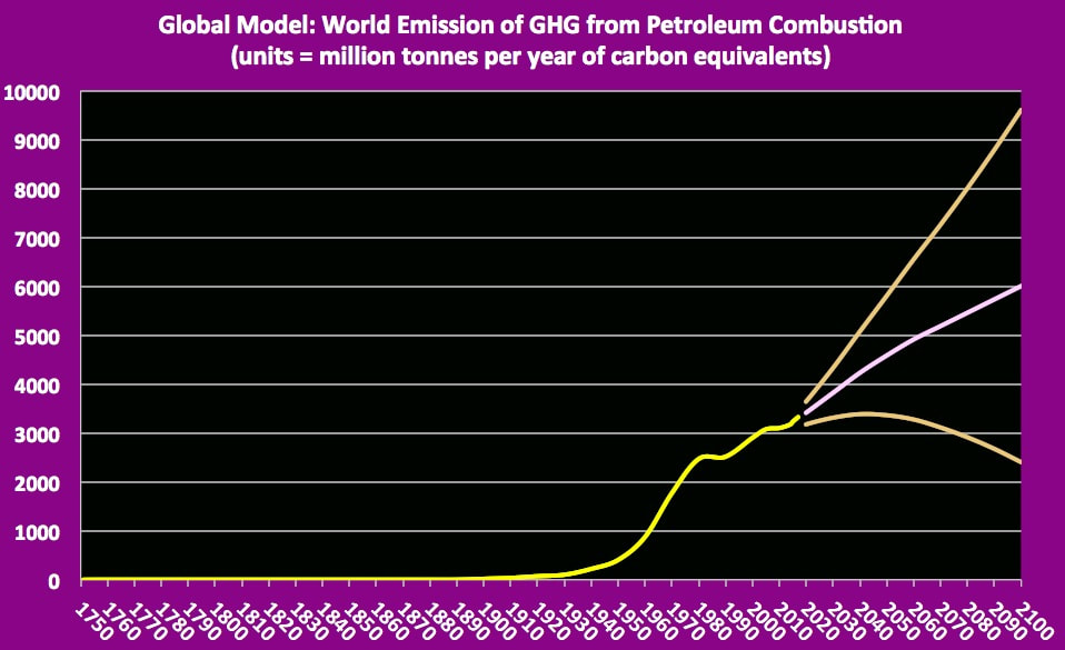
GHG emissions from combustion of petroleum
This chart shows GHG emissions produced by combustion of petroleum from 1750 to 2016. The chart emphasizes the fact these are modern-day emissions. Note that emissions have increased each year since 2000. My forecast is for continued long-term increase in GHG emissions.
2016 Update for Petroleum: GHG emissions increased just short of 2% from 2014 to 2015. Although this was within the previous forecast nonetheless it did trigger a forecast update which somewhat raised the future forecast.
2017 Update: GHG emissions from petroleum combustion increased about 1.4% from 2015 to 2016.
2018 Update: again GHG emissions increased about 1.4% above previous year.
GHG EMISSIONS FROM COMBUSTION OF naturaL gas

gHG emissions from combustion of natural gas
This chart shows estimated GHG emissions produced from combustion of natural gas since 1750, though there was little prior to the 20th century. Note that emissions have increased each year since 1950. So it is no surprise my forecast is for continued long-term increase in GHG emissions.
2016 Update for Natural Gas: GHG emissions increased just short of 2% from 2014 to 2015. This corresponded to the previous forecast.
2017 update: 2016 emission increased just as forecast. Sorry to say that this is hardly a surprise.
2018 update: 2017 greenhouse gas emissions from natural gas rose some 2.7% above 2016 levels.
GHG EMISSIONS FROM gas flaring
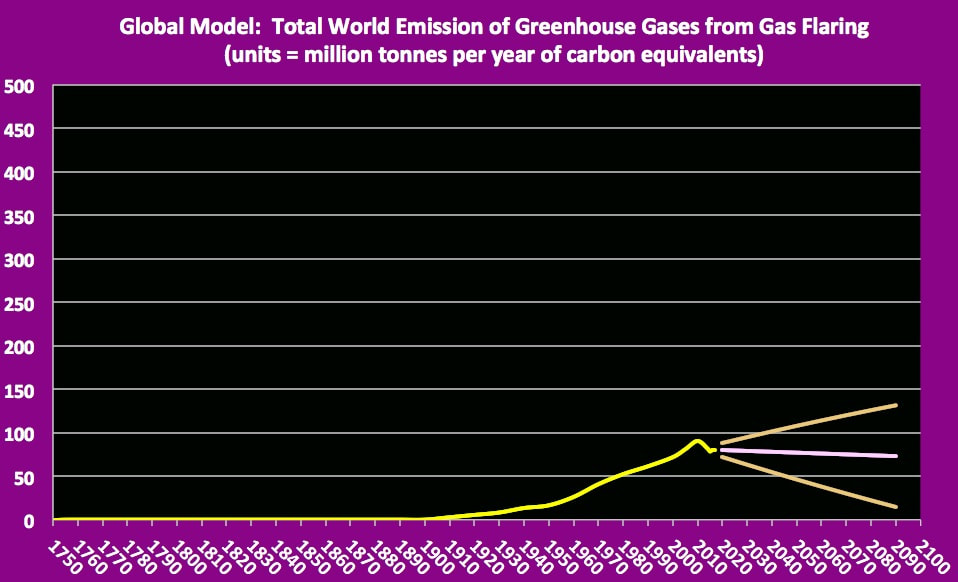
greenhouse gas emissions from gas flaring
Gas flaring is employed at many oil and gas production or processing sites to lessen dangers associated with the high pressure gases. With regard to greenhouse gases, two major pre-flare gases are CO2 and methane. The CO2 passes through unchanged but the methane is largely combusted to the much less potent greenhouse gas CO2. Other concerns about gas flaring include loss of product, dangerous attraction of birds to the flares, and generation of air pollutants.
My chart shows that levels of GHG emitted by gas flaring has greatly increased over the past century. Nonetheless gas flaring really is a relatively minor source of greenhouse gases compared to other emission sources. Since this practice both is highly visible and wastes a valuable commodity, I would expect this practice to lessen.
2017 update: Preliminary data for 2016 little different from 2015. This year's forecast model is much less optimistic than last year's forecast but even so might still be too optimistic.
2018 update: 2017 emissions similar to 2015 & 2016. I'll take no increase as good news.
GHG EMISSIONS FROM non-flared emissions during production

total world non-flared ghg release by fossil fuel production
This chart shows my estimates of how much greenhouse gas is emitted during production of coal, petroleum and natural gas summed. Certainly these ghg releases seldom are metered, so these really are very rough estimates. My opinion is that some estimate is better than no estimates; hopefully there is some truth to be seen in the main characteristics of these chart lines. Note the huge increase in release each decade since 1950. Sorry to say, but my forecast is for ghg release from fossil fuel production to increase in future decades.
2018 Update: Trend line on target & forecast remains unchanged.
2018 Update: Trend line on target & forecast remains unchanged.
ghg Release from Fossil fuels by Type & Summed

greenhouse gas emissions from fossil fuels by type

ghg emissions from production and combustion of fossil fuels
These 2 charts show the estimated annual emission of greenhouse gases from production and combustion of fossil fuels by type, and also the sum of these emissions. Looking at the Total GHG from fossil fuels, note the rapid increase in emission levels through the 20th century and please especially note the irresponsible acceleration of GHG emissions post 2000 after the dangers of climate change had been very well publicized. The recent several years show continued acceleration in GHG release rates.
2018 Update: 2017 total GHG emissions right on last year's forecast. Record high rate GHG emissions some 1.3% greater than for 2016 -- with no sign of needed reductions!
Year 1 after Paris Agreement: 2016 ghg emissions exceeded 2015 emissions & reached new record highs.
Year 2 after Paris Agreement: 2017 ghg emissions exceeded 2016 emissions & reached new record highs.
Greenhouse Gas Emissions from anthropogenic sources or activities other than fossil fuels
ghg from Cement production

total world ghg gas emitted by cement production
As can be seen on this chart, emissions of greenhouse gases from production of cement have increased rapidly through the 20th century into the early 21st century; recently the rate of acceleration appears to have slowed somewhat. My model suggests such GHG emissions derived from cement production most likely will continue to increase through coming decades of the 21st century.
Our modern world utilizes concrete extensively, from sidewalks, roads and runways, house foundations, buildings, bridges, dams and other works. The primary constituent of concrete is cement, which essentially is limestone baked in a kiln to high temperature, ground and mixed with gypsum. There are 3 sources of GHG release from the cement industry: a) direct emission of CO2 when limestone is baked, b) emission of GHG from burning coal or other fossil fuel to heat the kilns, and c) emission of GHG from associated industrial operations including mining and transportation. It is important not to double count the GHG emissions -- if GHG released from burning coal to heat the kiln is included in cement production emissions, then it should not also be included in the coal emissions, and likewise for petroleum used to fuel mining and transport.
Mitigation measures to GHG emissions from cement production include using less carbon intensive fuels than coal, using improved designs of kilns, blending other materials in the cement or concrete, and capturing the CO2. It has been suggested concrete itself can be used as a CO2 sink if fresh concrete is exposed to high concentration of CO2, but this is not a zero sum process. This short discussion is a simple introduction to a complex subject, for example no mention of non-C GHG, nor of problems such as fly ash & cement dust.
2018 Update: 2017 levels similar to 2016.
GHG FROM combustion of biofuel, combustable wastes, and culTivated biomass

ghg release from combustion of biofuels, combustable wastes and cultivated biomass
Once again we see the usual pattern of energy hungry world releasing increasing amounts of GHG in recent decades, and forecast to continue rapid increase in ghg emissions. In this case we're looking at carbon-based GHG emitted through energy producing combustion of all types of biofuels, of combustible wastes, and of cultivated biomass. Burning of waste biomass solely for waste disposal is excluded; also excluded is combustion of wild biomass.
2016 Update: Carbon-based GHG emissions from energy producing combustion of biofuels & biomass & waste continued to grow last year but at lesser acceleration, under a 3% increase from 2014 to 2015.
2017 update: 2016 showed an upwards surge in ghg from biofuels, combustible wastes and cultivated biomass.
2018 update: Increasing trend continues.
GHG from deforestation activities

GHG emissions from deforestation activities
This chart shows estimates of carbon-based greenhouse gases emitted each year world-wide by the process of deforestation. Not included are additional loses due to long term soil and peat degradation and loss of CO2 sinks. Also not included are nitrous oxide or other non-carbon based GHG.
2017 update: Change of data source to World Bank tables post 1990 resulted in large decrease in estimated forest loss both in recent years and in forecast model. Remember easing your foot off the accelerator still leaves you speeding forward.
2018 update: GHG from deforestation activities continued same in 2017 as for 2016.
ghg Release due to domestic combustion of wild biomass

greenhouse gas emissions from domestic combustion of wild biomass
This chart shows my estimation or perhaps more accurately 'guestimation' of global discharge of carbon dioxide from domestic combustion of wild biomass for such purposes as heating and cooking. My assumption is that such combustion is primarily rural based, and therefore a function of rural population. Since similar urban combustion is ignored, this likely may be an under-estimate. Gives us a ball-park however.
A reminder that if a family lives in a large forest that grows biomass faster than they burn it, no problem regarding climate change. But if a forest is consumed faster than it self-replaces biomass then yes a problem.
2016 Update: To keep the discussion parallel to those for other GHG sources, I'll mention that my model suggests emissions of GHG seems to have climbed slightly (about 0.6%) from 2014 to 2015.
2017 update: Slow increasing trend of ghg released from domestic burning of wild biomass estimated to continue.
2018 update: Model suggests increase in ghg emissions from domestic burning of wild biofuels continues.
ghg release due to long term land use change

GHG gas emissions due to long term land use change
This chart shows my model of long-term greenhouse gas emissions due to land use change. In summary, GHG release due to long-term land use change has increased in modern times, as mankind increasingly changes the landscape.
2017 update: new model adopted. New forecast significantly higher than last year's forecast.
2018 update: INcdeasing r3elease of ghg due to long term land use change continues.
2017 update: new model adopted. New forecast significantly higher than last year's forecast.
2018 update: INcdeasing r3elease of ghg due to long term land use change continues.
ghg release due to agriculture

Estimated ghg release due to agriculture
I think many people may find it quite surprising that a substantial portion of greenhouse gases released each year are due to agricultural practices from intensive fertilizer use, to cattle ranching , to rice production. Though I grew up on a small farm, I'll leave this to others to discuss.
As for my other anthropogenic sources of non-fossil fuel derived ghg, these estimates are from models and so have quite large uncertainty.
2017 update: Is it a surprise ghg emissions from agriculture are estimated to have again increased in 2016?
2018 update: Again a small increase over previous year.
GHG RELEASE DUE TO Chemical processing
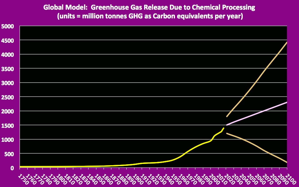
ghg release due to chemical processing
Hmmmm -- feeling some deja ju looking at this chart. That same old modern times increased release of ghg.
2017 update: 2016 shows substantial rise over 2015.
2018 update: 2017 significantly up, continuing on trend. To my eye, the forecast likely to increase next evaluation.
2017 update: 2016 shows substantial rise over 2015.
2018 update: 2017 significantly up, continuing on trend. To my eye, the forecast likely to increase next evaluation.
GHG RELEASE DUE TO Non-Energy Producing Waste Disposal
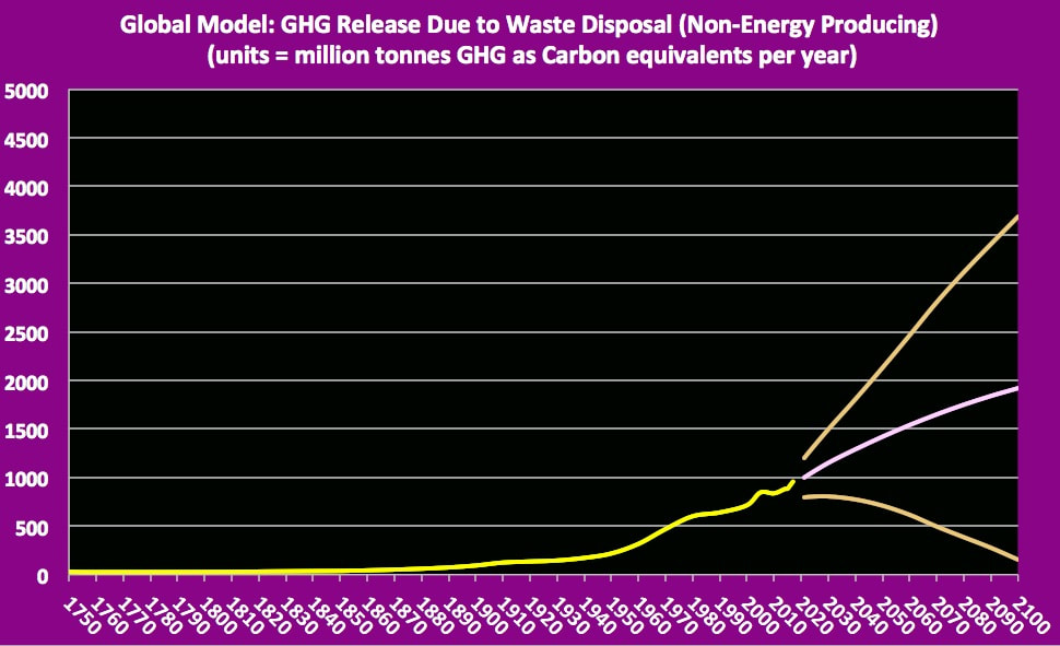
ghg release due to non-enegy producing waste disposal
Again the usual industrial age pattern of every increasing discharge of greenhouse gases. Recent years have seen an increasing effort to reuse, repurpose or recycle wastes or to combust them to produce energy. Since energy-producing wastes are tracked separately, this chart only includes ghg released from non-energy producing waste disposal.
2017 update: My model suggests a 4% increase in ghg released in 2016 as compared to 2015. I note a recent European estimate that waste disposal had increased some 2 to 4% last year and this rate of increase is expected to continue through the next decade.
2018 Update: Emissions trend still increasing.
Non-Fossil Fuel Anthropogenic Sources of greenhouse gases

anthropogenic greenhouse gas emissions not fossil fuel

summed non-fossil fuel based anthropogenic sources of greenhouse gases
These 2 charts shows my estimates of the mass of carbon-based greenhouses gases (expressed as carbon equivalents) released by anthropogenic sources other than fossil fuels. The first chart shows both subcategories and total; the second chart shows just the total non-fossil fuel anthropogenic ghg release. Each subcategory has been charted previously as stand alone charts, so please refer to those stand alone charts where overlapping trend lines are difficult to distinguish. The main point I'm trying to show is that there are multiple anthropogenic sources of greenhouse gases other than fossil fuel combustion, and that most these sources are releasing much more GHG now than prior to the modern industrial age. A caution that my models in this area are based more on deductions rather than objective measurements.
In the first chart I marked the line representing ghg release due to agricultural practices. This category of greenhouse gas release seems to be increasing much more rapidly than other categories the last 80 years or so.
2017 update: My charts differ from previous years in that ghg from cement production has been moved from fossil fuels to non-fossil fuels, and both flared & non-flared ghg release has been moved from non-fossil fuels to fossil fuels. Nonetheless the increasing acceleration in ghg release through modern times remains unchanged.
2018 update: yes, still increasing...
Total Anthropogenic ghg release = sum Fossil Fuel + non-Fossil Fuel releases
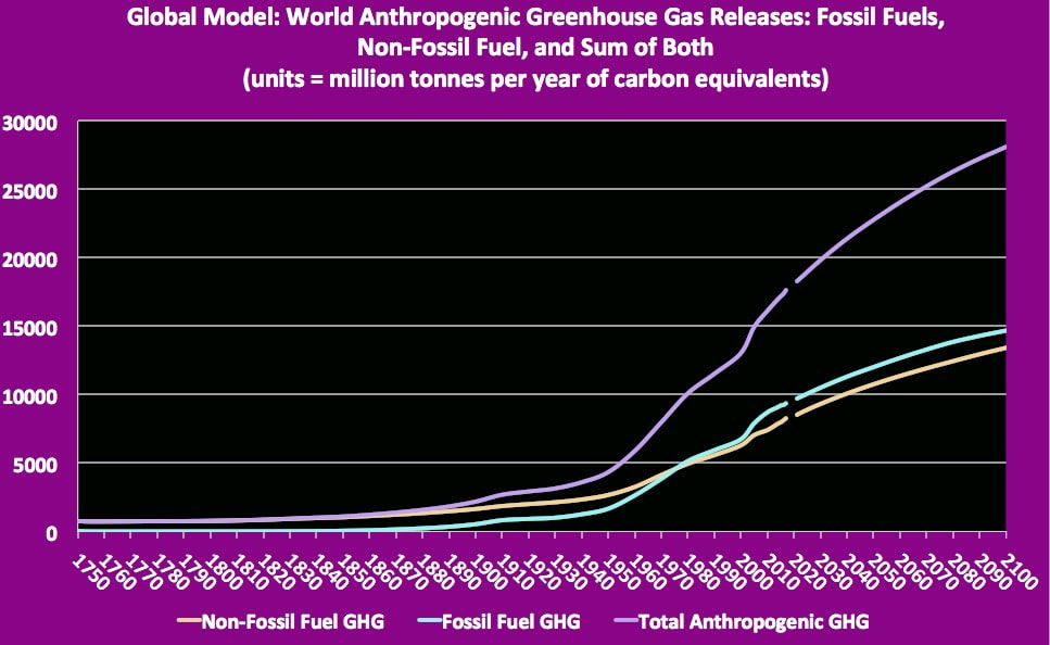
estimated total world anthropogenic emissions of greenhouse gases: fossil fuel, non-fossil fuel and sum

estimated total world anthropogenic emissions of greenhouse gases
These 2 charts show my estimates of the total anthropogenic sources of greenhouse gases. For the first chart, the three chart lines are respectively are ghg emissions derived from fossil fuels, derived from other than fossil fuels, and both these summed together. The second chart shows just the single trend line for all anthropogenic derived greenhouse gas emission.
Looking at the left side of these charts, it is sobering to see than even in 1750 humankind were releasing significant amounts of ghg. However once we began to crank up use of fossil fuels, release of ghg from both fossil fuels and other industrial scale activities grew very rapidly. (A reminder I have previously charted the various sub-catagories of fossil fuels ghg sources, and of non-fossil fuel ghg sources, and my charts are free to examine.)
Looking at the middle right you can see where ghg from fossil fuels really accelerated upward, becoming our dominant source of greenhouse gases. Moving to the right of these charts you come to my forecast models -- not a pretty picture as we seem to be locked into ever increasing spewing out of greenhouse gases. No wonder we are already seeing impacts of climate change.
Some people hope that the 2015 Paris Agreement will get us out of the climate change trap by reducing the world anthropogenic emission of greenhouse gases. That most certainly will be easier said than done! But we can readily track the success:
2017 update: My charts differ from previous years in that ghg from cement production has been moved from fossil fuels to non-fossil fuels, and both flared & non-flared ghg release have been moved from non-fossil fuels to fossil fuels. Nonetheless the increasing acceleration in ghg release through modern times remains unchanged.
2018 update: Both fossil fuel and non-fossil fuel ghg emissions continue rapid increase.
Year 1 after Paris Agreement: 2016 ghg emissions exceeded 2015 emissions & reached new record highs.
Year 2 after Paris Agreement: 2017 ghg emissions exceeded 2016 emissions & reached new record highs.
feedback Loop enhanced release of greenhouse gases
A feedback loop (sometimes know by terms vicious circle, vicious cycle) describes a system of linked problems where growth of one problem exacerbates a second problem, the exacerbated second problem exacerbates another problem and so on around the loop of linked problems repeatedly.
Two important feedback loops presently are of concern with regard to global warming caused by increased concentrations of greenhouse gases in the atmosphere. The first feedback loop involves GHG released by wildfires, and the second feedback loop involves GHG released by melting of permafrost. The following charts show the greenhouse gases released to the atmosphere from wild fires and from permafrost melt, from which we can make some judgment as to the status of the relevant feedback loops.
The literature does show some discussion of a third possible feedback loop should oceans warm sufficiently to change from GHG sinks to GHG sources.
feedback loop #1: Greenhouse Gases emitted from wild Fires

greenhouse gases from wildfires with forecast
With increased global temperatures one would expect wild fires to become more extensive, and since wild fires emit greenhouses gases, more extensive wild fires should increase atmospheric content of GHG which will increase greenhouse warming of the atmosphere, which in turn will cause wild fires to become more extensive, and so on around and around the first vicious feedback cycle.
I found some variety of estimates how much GHG is produced by wildfires, not surprisingly since it depends on the type of' material being burned. I decided to use 25 tonnes of carbon equivalents per hectare wildfire for my model. Not included in my estimates are long term effects of fires such as soil deterioration. Also disregarded in my estimates is the fact all too many wildfires have been initiated by people whether deliberate or accidental.
Looking at my chart, clearly 21st century emissions of greenhouses gases from wildfires exceeds 20th century emissions. My model forecast suggests annual wildfire emission ofGHG likely will continue to increase but with great year to year variance.
2016 Update: Due to large year-to year variance I compared 2015 results to average 2005 to 2014 GHG emissions from wild fires rather than to 2014 emissions. 2015 GHG emissions from wild fires were estimated to be some 15% greater than the previous 10 year average.
2017 update: hindcast model removed. 2016 GHG release significantly below that for 2015 but still well above most 20th century releases.
2018 update: 2017 below that for previous year and barely above earlier decades. Forecast reduced from rising to flat.
Addendum: Some people suggest that CO2 or GHG for wildfires or from burning biomass of any kind should be disregarded as zero emissions since the forest or other biomass can regrow. The flaw in this argument is time. It takes decades for a forest to regrow. Conversely wildfires release GHG very rapidly.
Putting GHG from Wildfires into context

comparison of ghg from wildfires to those from combustion of fossil fuels
This chart better puts greenhouse gases from wildfires into context by comparing them to total anthropogenic GHG emissions, although I only have good estimates for GHG from wildfires since 1960. The earlier data for ghg from wildfires are just 'guestimate' hindcast.
Comparing the two trend lines, clearly in modern times, GHG derived from anthropogenic activities have grown to levels exceeding post-1960 levels from wildfires. In future decades it appears likely that anthropogenic GHG will even more rapidly exceed wildfire GHG. It is all sources of GHG together driving climate change. If we genuinely do wish to rectify anthropogenic caused global warming, then we must reduce GHG emissions from anthropogenic sources sufficiently to counter recent increases in atmospheric GHG not only from anthropogenic sources but also from anthropogenic triggered global warming.
Judgement re feedback loop: Without anthropogenic GHG likely were handled by natural GHG sinks and thus the feedback loop was of little consequence. However now climate change has been initiated by anthropogenic release of GHG, the GHG from increased wild fires has significant impact. Anthropogenic GHG reduction must be sufficient to counter both anthropogenic GHG impacts plus wild fire GHG impacts. The longer we wait the larger reductions we must make.
2018 update: I changed chart from annual post 1960 to smoothed data for wildfire ghg so as to more clearly see underlying pattern. Rather than rising or flat, trend now looks to be slightly falling. Also one does wonder why 'wild' shows such a clear anthro signal in last decade of 20th century.
feedback loop #2: GREENHOUSE GASES Released by Melting of Permafrost

GHG release due to permafrost melting
With increased global temperatures the polar permafrost has begun to melt. As the world grows warmer the permafrost is expected to melt at an ever increasing rate. As the permafrost melts, greenhouse gases will increasing be released from the melted soils and sediments and also from from exposed talik and dissociated methane clathrate. Presently we are still in the early stages of permafrost melting. However if mankind fails to reduce our emission of greenhouse gases quickly and substantially, then once the permafrost melt becomes more extensive, the released GHG could become so large that a vicious feedback cycle could be initiated: more GHG released into atmosphere; greenhouse effect raises global temperature further; more permafrost is melted; more GHG is released..... Early substantial reduction in anthropogenic greenhouse gas emissions is urgent.
2018 update: Note trend line hqs begun to move above the X-axis. Also my 2018 model is reflects a slower melt prediction than my earlier model. Touch wood.
2018 update: Note trend line hqs begun to move above the X-axis. Also my 2018 model is reflects a slower melt prediction than my earlier model. Touch wood.
PUTTING GHG FROM Permafrost melt INTO CONTEXT

comparison of ghg from permafrost melt to those from all anthropogenic sources
Presently melting of permafrost is releasing relatively minor amounts of GHG each year compared to mankind's release of GHG. However, the longer we delay curtailing anthropogenic greenhouse gas emissions, the more likely GHG release from permafrost melt (and from related release from talik and from methane clathrate dissociation) will make our necessary reductions too large to be practical. There is some possibility that release of GHG due to permafrost melt might become so large as to be self-supporting in feeding the feedback loop. We have already delayed sufficiently that the necessary reductions in anthropogenic GHG will be difficult to implement. We have decades not centuries to fix things!!!
